
Data and Design: When Opposites Attract

Left brain, meet right brain. Complete opposites. The left side deals with analytics and numbers. It’s systematic. The right side is intuitive, creative and free thinking. Although they are opposites, when each side works together, it creates a relationship that evolves as it learns. The same is true for marketing’s data and design.

When your data and design teams communicate the insights they find, your resulting messaging packs more punch. Your brand becomes more personal to your client, which leads to improved results. Here’s how.
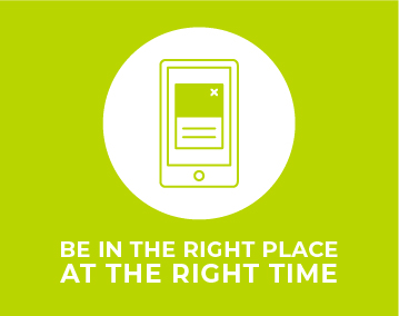
Placement

You want to be at the right place at the right time. This is one of the top reasons why data and design need to work together. Data can tell you where your target markets are most likely to be, how they use their different devices, and what types of content help them make decisions. For design, this intel can help determine which messages and calls-to-action will be the most relevant for the audience. Depending on the type of ad placement, it also informs designers on how they need to take that message across devices and platforms. You might be able to have a seven-word headline on a print ad, but that may not be the best approach for mobile. You only have a moment to capture impatient readers on their smartphones so a better strategy would be to focus their attention on a compelling call-to-action.
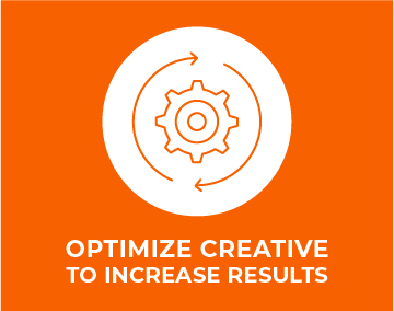
Optimization

Any great marketing campaign has some sort of ramp-up period where multiple messages and placements have been tested. The strong survive. Tracking your creative across placements helps you understand which messages deliver the most interest, those that generate the greatest action and those that flop. Data teams should be reviewing and measuring creative against website behaviors and conversions. By sharing these insights with the designers, you’ll find that they usually have ideas on how to optimize the creative to increase results. Not sharing information and keeping it hidden in silos reduces the campaign effectiveness and lessens your return on investment. 

Proof

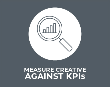
It’s demoralizing when creatives pour their energy into a project only to hear a few months later that “it didn’t work.” More often than not, less-than-stellar outcomes stems from not setting up the right key performance indicators (KPIs) in the beginning.

Measuring creative against KPIs for actions like content downloads, contact form fills, click-to-calls and email sign-ups, tells you how effective that ad was in delivering not just a lead, but one ready to take action. Other metrics around the creative, such as engagement metrics on social ads and viewership on video, tell you how well you are capturing attention and where you might be losing people.

Balance

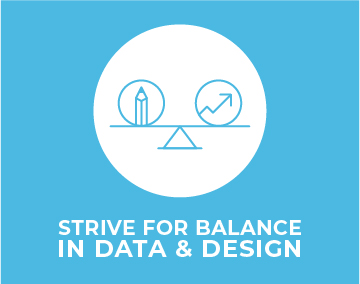
The key to success between your data and design teams is the ability to parse out the story in the data then create the next chapter. Strive for balance in the conversation. Analysts shouldn’t drill designers with a firehose of numbers, which only leads to analysis paralysis, but should provide context and actionable insights. Designers should be open to learning enough about the data so they know how to ask the right questions and suggest customized creative solutions. Keep the conversation going throughout the campaign.

At our agency, these conversations happen constantly. Some are scheduled. Others happen organically. We review metrics regularly and share how things are going in brief, weekly meetings. To foster greater collaboration, we invite our designers to tap into our analytics tools so they can review the progress firsthand. The goal: generate ideas that lead to ever-better results.

The relationship between data and design teams creates a bond between two opposite thinkers, one that should deliver more success. By measuring the effectiveness of your creative and adjusting as needed, you can turbocharge your campaigns. And, equally important, when your CEO asks how things are going, you’ll have metrics to back up your statements.


Psychology of Color Affects Response to Marketing

Color surrounds and influences us. Good marketers use it wisely, even in their words. Early in my career, when I worked as a designer at Boeing Wichita, I was told I was “fuchsia silk in a gray-flannel world.” I took it as the compliment it was intended to be. The remark stuck with me, in large part, because of the colorful image it painted.

Color could be one of the least understood, yet most valuable tools in your creative arsenal. Let’s rectify that. Don’t worry, I’m not going to go into a technical discussion about the color wheel and primary, secondary and tertiary palettes. Or concerns about luminance, reproducibility and perception. I’ll focus on leveraging color theory, because the psychology of color directly affects how people respond to your marketing.

Consumers’ ever-shorter attention spans make color even more vital. Color makes an immediate, automatic impact. It suggests meaning and evokes emotion. It influences behavior. Color can attract or repel. It guides you through a physical space or an online form. It builds connection and brand loyalty. It can cause you to open your wallet, or snap it shut.

psychology-of-color-green-blueSet the Mood

Colors can be cool or warm, and they likewise affect our emotions. Colors in the red, orange, yellow range stimulate and make you feel happy. That’s why fast food restaurants use warm tones, to turn on your taste buds. Hues in greens and blues conjure calm. Healthcare organizations and spas use cool, calming palettes to lower your blood pressure and create a sense of peace.  When choosing your color palette, consider the response you’re after.

If you want people to think of an event as a refined, high-brow affair attended by influential people,  try a neutral, monochromatic theme. Think grey, white, black and camel.  Add a pop of metallic silver, gold, copper to add opulence and ultra-affluence. Want to create a hot happening that will get hearts thumping and people out on the dance floor? Go red, magenta or other high-intensity colors with lots of saturation and impact.

psychology-of-color-purple-pinkColor Matters

Research shows that Americans prefer blue (35%) and green (16%). Studies suggest men favor cool colors, while women lean toward warm ones. Culture, age, gender, time and place all play a role in the meaning of colors, of course. Red can signify romance or danger. It can stimulate or stop you, but it definitely gets your attention. Gold is almost universally recognized as a signifier of sovereignty, of achieving status and wealth. Purple, the regal color of royalty, is also associated with creativity. Perhaps that’s because it’s a mixture of blue (relaxing) and red (energizing). Neutrals can make your brand appeal high-end, timeless and classic.

psychology-of-color-blue-purpleTarget Your Audience

Color has distinct personality. More than two centuries ago, in 1798, Goethe and Schiller created the Rose of Temperaments. It categorized professions and character traits into four overall buckets, each with a set of defining colors. The language feels old school to us now, but the insights still have value.

  • CHOLERIC: Red/orange/yellow. Tyrants, heroes, adventurers. Alpha, take-charge leaders.
  • SANGUINE: Yellow/green/cyan. Hedonists, lovers, poets. Social extroverts who create.
  • PHLEGMATIC: Cyan/blue/violet. Speakers, historians, teachers. They get stuff done.
  • MELANCHOLIC: Violet/magenta/red. Philosophers, pedants, rulers. Analysts, scientists and programmers.


psychology-of-color-orange-yellow

Consider Point of Purchase

Make your first impression lasting and positive. Studies show that consumers make a judgment on a product within the first 90 seconds. As much as 60-90% of that is based on color. Corporate logos with colors appropriately linked to their products and services have an advantage. Color affects how we think about a brand, and those feelings affect buying intent.

What you call your color affects consumer preference, too. Given the choice of “brown” or “mocha,” for instance, consumers overwhelmingly prefer the imaginative name. Manufacturers are right to offer aircraft liveries with options like solar yellow, Athens blue and mantis green.

Brands evolve and good logos change with them. Crayola provides a strong testament to the power of color. Even though the Crayola logo has changed many times since the company’s founding more than 100 years ago, the packaging has never veered from its classic yellow and green. You go to the shelf and there’s no missing that distinctive brand or confusing another crayon manufacturer with it.

As you think through everything from print ads to tradeshow booths, remember warm colors appear to advance, while cool colors recede. Studies show that warm colors evoke more spontaneous, unplanned purchases, while cool colors rate more favorably and appropriately for planned, long-deliberated purchases. So, when you see that sea of blue at the next aviation tradeshow, know that it represents not only blue skies and flight, but a highly rated consumer color that positively influences buying behavior. Blue affects perceptions of time, too. Time feels shorter when watching a blue screen rather than a red one. A good thing to know when you want people to linger.

Color is light. Color is energy. And, in marketing, color is money.

This article originally appeared in the February 14, 2018 issue of BlueSky News.


Getting to Know: Ashley Bowen Cook

Wichita Eagle contributor Joe Stumpe interviewed Ashley Bowen Cook about her career and recent appointment to the Wichita Aero Club’s board of directors.

Click here to read Getting to Know: Ashley Bowen Cook on kansas.com.


Sonia Greteman Testimonial Video Celebrates the Value of Girl Scouts

Wichita, Kan. – When Girls Scouts of Kansas Heartland CEO Liz Workman casually asked Greteman Group President and Creative Director Sonia Greteman if she’d consider providing a testimonial video to say what Girl Scouting has meant to her, Greteman answered yes, equally casually. And the months went by.

Six months later, Sonia decided it was time to step up and deliver. She dashed off a script and solicited Greteman Group to shoot and pull the video together. The resulting two-minute testimonial provides a glimpse of Greteman you don’t usually see.

“Sonia’s known for her strong, professional leadership and cosmopolitan style,” says Workman. “Pitching a tent and singing by a fire are not activities you easily associate with her. Which makes the video that much more powerful. Sonia shows how Girl Scout experiences molded her into a powerhouse woman.”

Greteman talks about how vividly her Brownie then Girl Scout memories have stayed with her. Taking her first big trip. Exploring the Kansas State Capitol and having her life changed forever when she saw its John Steuart Curry murals, her first monumental pieces of real art. Learning synchronized swimming and the teamwork it takes to create big, crowd-pleasing effects

“I’ve always been a motivated girl, and I particularly liked the concept of badges,” Greteman says. “With Girl Scouts, you learn something new and you get a reward. I liked getting things done and sewing the proof on my sash.”

Girl Scouts taught Greteman valuable early lessons in business. She discovered she had a knack for sales, knocking on doors, smiling big and convincing others that those cookies were not simply delicious; they were her ticket to summer camp.

“Girl Scouts works,” says Greteman. “It helped me build friendships, learn how to set and achieve goals, and opened my eyes to my own strengths. I believe in the benefits of the girl-led and girl-friendly environment Girl Scouts provides, ensuring the creation of a safe, inspiring space for girls of all ethnicities and economic backgrounds to learn and thrive.”

Workman agrees. “Girl Scouts’ century-long experience of serving girls and its ongoing innovations to stay fresh and relevant make it the world’s best girl leadership organization.”

If you want to volunteer or enroll in Girl Scouts, visit https://www.kansasgirlscouts.org/.

Greteman’s testimonial video.

ABOUT GIRL SCOUTS OF KANSAS HEARTLAND

Girl Scouts of Kansas Heartland serves more than 15,000 girls and adults in 80 Kansas counties through its operational headquarters in Wichita, Kan., and regional offices in Salina, Hays, Emporia and Garden City. Founded in 1912 by Juliette Gordon “Daisy” Low, Girl Scouts is the leading authority on girls’ healthy development and is the preeminent leadership development organization for girls. Girl Scouts builds girls of courage, confidence and character who make the world a better place. The national organization is more than 2.6 million strong: 1.8 million girls and 800,000 adults who believe in the power of every G.I.R.L. (Go-getter, Innovator, Risk-taker, Leader) to change the world.

ABOUT GRETEMAN GROUP

Greteman Group has developed an international reputation as an aviation-specialty marketing agency based in Wichita, Kan. – the Air Capital. Leading aircraft manufacturers, flight support, aftermarket services, fractional ownership, insurance, in-flight Wi-Fi, regional airlines and airport analytics have entrusted their brands to Greteman Group. Clients include FlightSafety International, Wichita Eisenhower National Airport, Clay Lacy Aviation, JetHQ, USAIG, King Aerospace, EPIC Fuels, Signature Flight Support, Vantis, Piedmont Airlines and Aviation Partners. It also supports causes and clients such as the Tallgrass Film Association, Mark Arts, the City of Wichita, Wichita Water Partners, AGC Kansas, GLMV Architecture and MKEC Engineering. The firm is a founding member of the Wichita Aero Club and a longstanding member of the National Business Aviation Association (NBAA). Since its founding in 1989, this certified women-owned business enterprise (WBE) has developed a team of purpose-driven pros.