Brand surveys conducted with Hutton staff, professional partners and clients delivered remarkably consistent results: Hutton inspires trust and loyalty through intense collaboration, professional integrity and high-quality results. An audit of the existing brand, including website, collateral and logo, revealed Hutton was not capitalizing on its considerable strengths and competitive advantages. It did not stand out or distinguish itself from the competition.
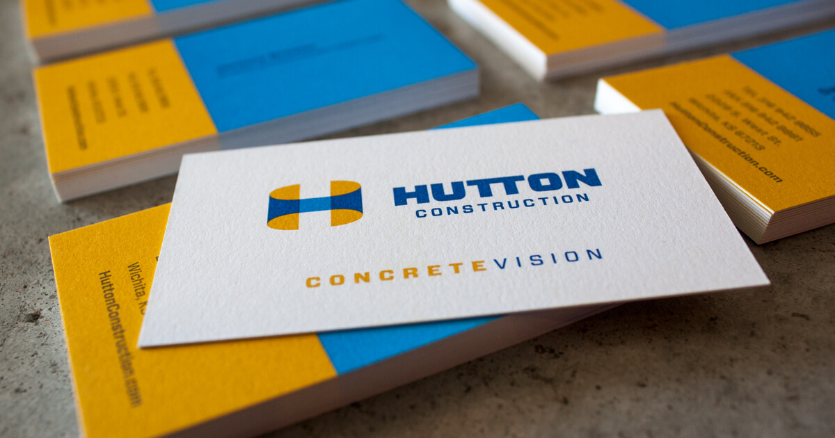
Hutton’s re-imagined brand keys on the new tagline: “Concrete Vision.” This refers not only to construction materials, but also to the company’s expertise in taking ideas and concepts and making them real. The new logo showcases the shape of the “H” in a three-dimensional tubular form, reinforcing the team’s rounded, collaborative approach. The typeface conveys strength, with the joined “T”’s forming a structural beam. The sky blue color implies vision, while a strong yellow suggests light and creative energy. Hutton applies its new brand to everything from trucks and hard hats to advertising and site signs as well as to an easily updated, content-managed website. Everything communicates strength, expertise, intense collaboration and dedication to finishing the job on time and on budget. Online project case studies provide concrete work examples in medical, faith-based, manufacturing, recreation, financial, community, education and senior living.
Prospective clients looking for a construction partner they can trust appreciate Hutton’s pledge to deliver work that meets and exceeds their expectations. They get the message that incredible planning sets Hutton apart. While other companies may want to fire up the bulldozers and immediately get to work, Hutton takes the time early on to think things through – saving money, reducing headaches and ensuring quality. They know they’ll be gaining a team member with both farsighted imagination and down-to-earth problem-solving, ensuring the highest quality outcome.
View MoreSee more of our digital work for Hutton.