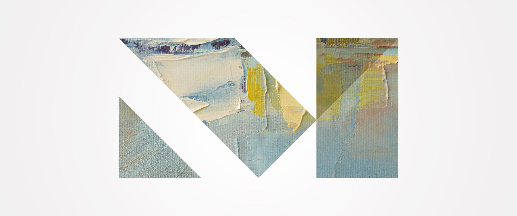
The logo consists of a clean, stylized and modern “M” letterform with an abstract “A” embedded in a diagonal shape. Classic geometric forms build a dynamic, three-dimensional symbol. It reproduces beautifully in one color or in a variety of vibrant and appropriate color variations. It works across media: signage, web, print, email, TV and video. This logo breaks through, creating something unique and timeless. The logo window becomes our transformational “big idea.” It affords endless opportunities to fill it with ever-changing palettes, textures, artwork, patterns and photography. This fluid ability to constantly morph keeps it relevant and delightful. It creates a canvas that can be serious one moment and playful the next. This logo mirrors a Kansas sky. It changes every time you look at it.
It works across media: signage, web, print, email, TV and video. This logo breaks through, creating something unique and timeless. The logo window becomes our transformational “big idea.”
The chosen name – Mark Arts – is based on the initials M.R.K. but offers greater meaning. It communicates the idea of making your mark. Throughout history, artists have left their imprint on their work. Their mark. This has often been called a maker’s mark. It can be a stamp, a seal, a signature, a brushstroke or a symbol.
The logo and name create an identity that captures attention across traditional and new media, from collateral and wearables to the website and enews. It can connect with current supporters while reaching out to new audiences. It appeals to a broad demographic: young and old, urban and rural, wealthy and underprivileged. It welcomes and encourages all to enter the doors. We chose not to include Wichita in the name because our goal as a regional art center has a bigger footprint. We were able to secure MarkArtsKS.com as its URL, further clarifying the larger geographic target market.
Mark Arts recently launched a capital campaign to realize an important part of its strategic plan: expand its highly popular, full-of-promise culinary arts studio. It turned to us to create a piece that turns up the burner on giving. Our Taste of the Future brochure links cooking to art with charming illustrations. Tabbed sections guide potential donors. Budgets show where giving goes. A schematic looks good enough to eat. The campaign hit its fundraising goal in only three months, crediting part of this success to a comprehensive piece outlining the need, vision and opportunity.