LawKingdon is known for unmatched expertise. A high concentration of engineers helps ensure that large, multifaceted projects are completed on time and on budget. Its reputation is a great asset. However, a solid, proven brand built on an expectation of quality and fiscal responsibility does not necessarily connote an ability to produce innovative designs. LawKingdon needed a brand that lent cohesion, highlighted creativity and celebrated the firm’s unique strengths.
There was real equity in the LawKingdon logo: to scrap it and start over would have been foolish. Instead, we offered a fresh take by giving the logo and wordmark a facelift and dropping the stuffy “Inc.” We introduced a bold red-yellow-black color palette and a tagline that speaks to process and big-picture thinking: “Inspire. Create. Achieve.”
When an old friend says it’s time to present a new face, we dig in to uncover fresh material.
SONIA GRETEMAN
agency president
and creative director
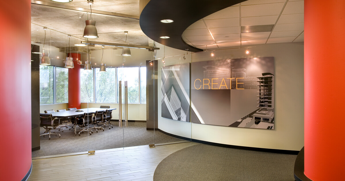
We applied the updated brand to a variety of media. A dynamic new website communicates the revamped brand while a new stationery package and proposal template provide day-to-day brand continuity. LawKingdon’s gutted and renovated office serves as an immersive portfolio. Down came walls. Former hidden river views deliver ever-changing scenes. Monumental-scale graphics tell stories. Everything works together to create an architectural showcase that’s clean, modern and collaborative.
Since a company’s employees are its most important brand advocates, an internal event and pocket-sized, grommeted graphic standards helped ensure team members understood and embraced the brand. Notched business cards encouraged ad hoc building of paper structures. Advertising communicated the new look and messaging. A soaring three-dimensional invitation lent a must-attend air to a VIP event that debuted the revamped office and brand to clients, city officials and the region’s who’s who. The response was phenomenal. People raved. LawKingdon’s invigorated brand breathed new life into this architectural institution, generating buzz in and out of the office. And helping attract clients and talent.