
How to Brand a City: Refreshing Wichita’s Identity
01.24.20 · Sonia Greteman
James Chung challenged Wichita to be bolder in our vision. Our partners at the city took that to heart. They took a hard look at Wichita’s city branding and asked if it’s time for an update or a complete reimagining.
How to Brand a City
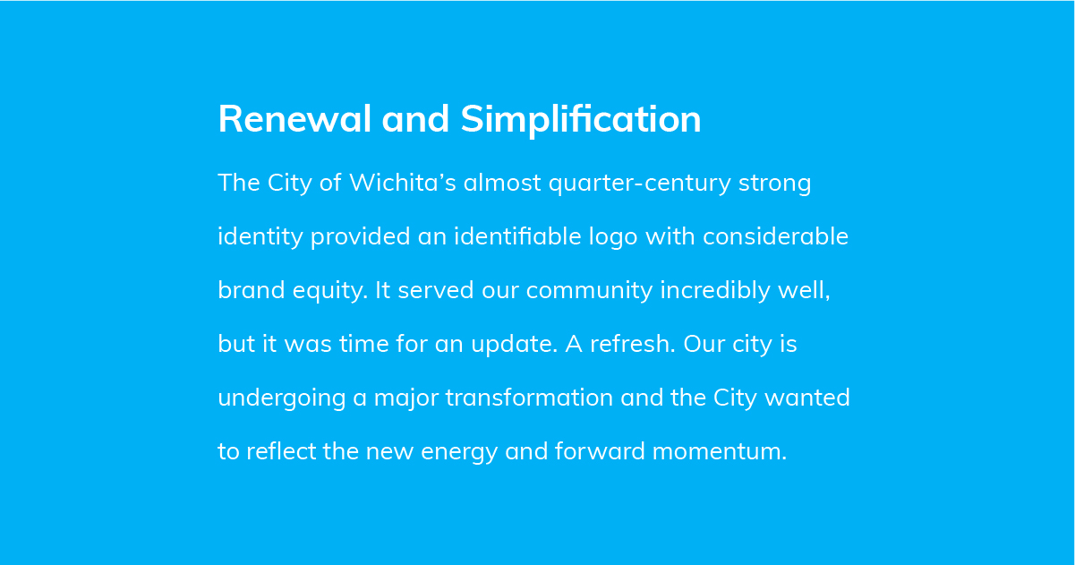
Greteman Group created the City of Wichita’s identity 25 years ago. It was time to take a fresh look at where we are as a community and where we’re going and to ensure the identity reflects our future. Plus, the city needed new tools and enhanced digital dexterity to help create a cohesive masterbrand. Here was our approach to how to brand a city and the result.
We did our research. Studied what other city brands are doing. Surveyed city stakeholders and design peers across the United States. Looked at innovative cities and how that is reflected through inspiring, community-enhancing identities. Equally important, we spoke with the city’s marketing team, learning what was working and what could be better. A discovery workshop provided a face-to-face platform for talking through our findings and encouraging robust conversations.
Evolution or Revolution?
How do you know whether to evolve an identity by building off the past, or to start fresh? First, consider how much value your existing logo has built up over the years. If the logo has significant equity, evolution may be the best path forward. You can evolve, update, refine and refresh the existing identity by going through a process of simplification. Fonts, complexity and color palettes are some of the first things to date a brand, so updating these elements offers a proven, highly accepted and often-used strategy.
The advice of Paul Rand, one of the most highly respected designers of all time, still rings true. (If you need a memory jog, Rand designed logos for IBM, UPS, ABC, Enron and many more.) When looking at an identity, ask – is it distinctive, memorable and clear? Will it stand the test of time? Remember, simplicity is the ultimate sophistication. It is the byproduct of a good idea.
Making an Informed Decision and Moving Forward
Our research revealed that the existing Wichita logo had served the community well. The identity enjoyed strong brand equity and at-a-glance identification. After all this time in the public eye, it had achieved a high level of trust and recognition. So we removed a new identity from the table and looked at how we might build off of the current logo’s strengths.
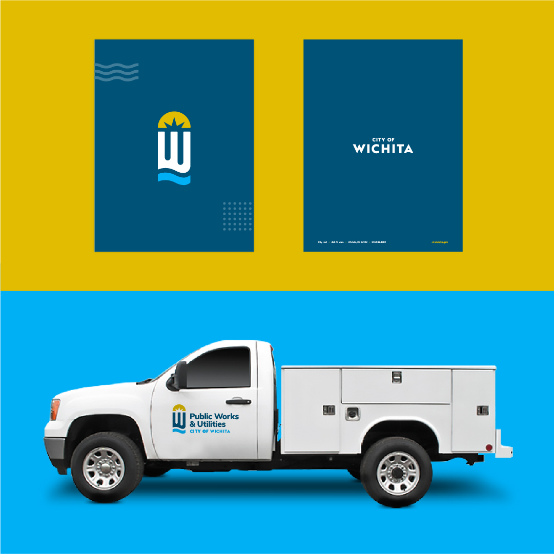
Wichita’s identity essence remains, while updates simplify and strengthen the mark. This evolution streamlines the river motif and sunburst, and removes the limiting contrail. It creates a heavier “W” and updated fonts, modernize the wordmark. A refreshed color palette feels current, moving away from the green teal to a clear, clean sky blue. A phased rollout unifies city departments under a masterbrand and communicates a city on the move.
Realizing the Benefits of Standardization
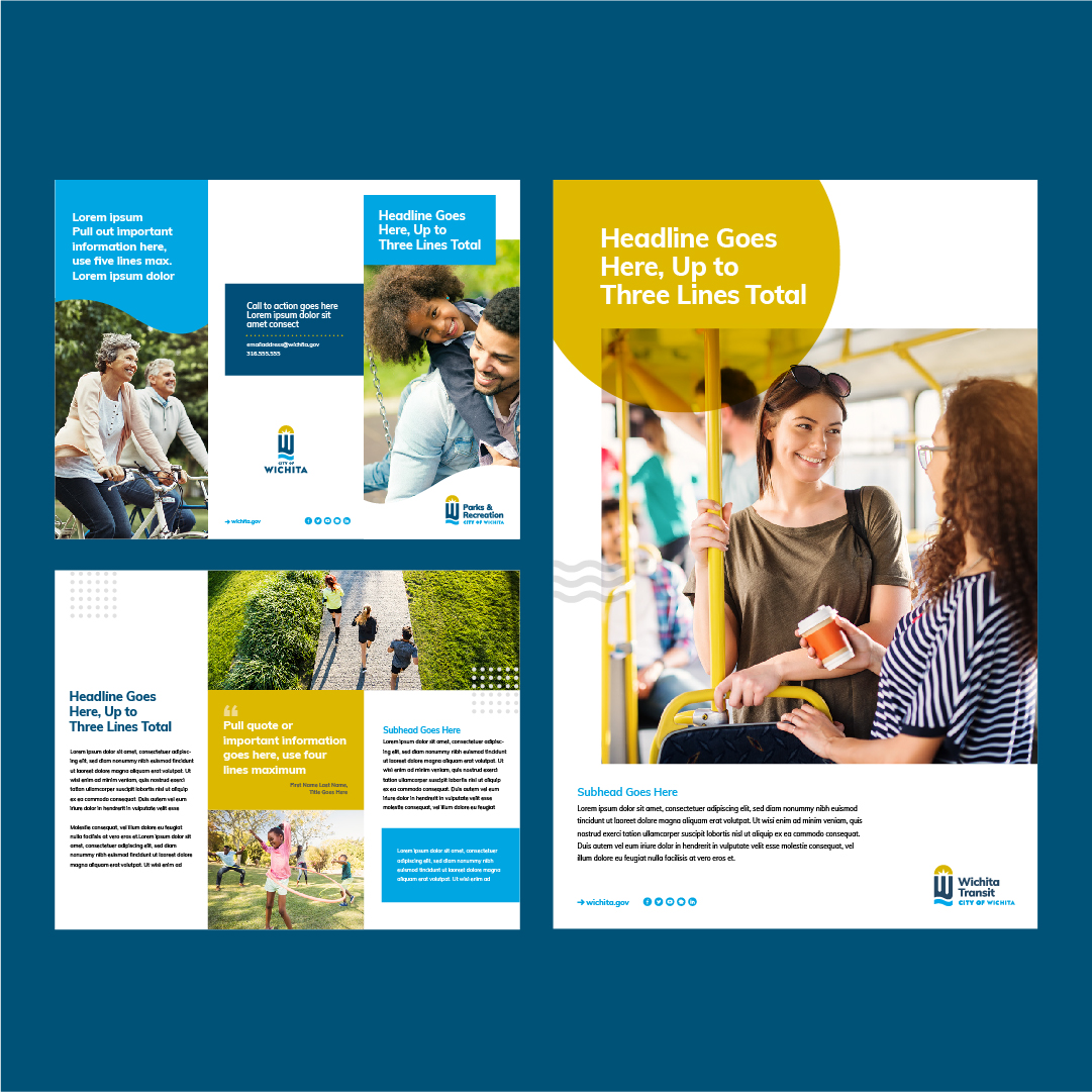
Before the rebrand, the city didn’t have comprehensive guidelines for internal or external marketing teams to follow. The robust, new graphic standards foster consistency in a user-friendly digital format. Templates for posters, brochures, collateral and wearables improve quality and reduce costs. They help present Wichita as a progressive, forward-looking community. That said, we don’t believe the average citizen will even recognize the logo has changed. They’ll just think it looks good.
Are you asking how to brand a city? We can help.