|
n the 20 years I’ve been at Greteman Group, I’ve been a part of designing and coding more websites than I can count. And I can say without hesitation that it becomes more of a pain with each passing year. |
Our first site, for our own agency, was a small, beautiful thing. If you saw it today you’d wonder what that was in the corner of your gigantic monitor, the likes of which we did not have in the mid ’90s, and which would have probably terrified us.
| There weren’t many pages. There wasn’t much text.We didn’t care about how we ranked in Google searches, because Google didn’t exist. Neither did Facebook, Twitter, LinkedIn or any of the other billion social media sites whose little icons I find necessary to put on websites now. |
|
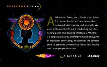 |
| Our first home page in the mid-’90s sure stood out. Yes, we know the nav buttons (the round things) weren’t labeled. It was a simpler time. |
Then VS Now There was no video or fancy-schmancy moving graphics. It would have taken days to download anyway, given the fact we were all on slow-as-molasses dial-up modems that sounded like you were strangling a robot to death. There was no Flash or Javascript, so interactivity was limited to clicking on something and hoping that it took you somewhere relatively interesting. Coding websites was simple, simply because there wasn’t much at all to the HTML language.
 |
If a designer asked me to put a particular graphic in a particular place, I would say no, you can’t do that.Then they would walk off with their head hung low and I would put the graphic where I could. Which usually meant centered on the screen. Oh, and our site was optimized for Netscape Navigator. And NOTHING ELSE. |
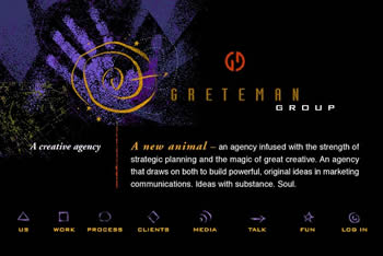
| Just two years later, we launched a site that was a bit more traditional – except for the odd button icons and disembodied hand. |
An Evolution of Design But for what it was, our website had style. Other sites were made horrible by adding visitor counters that looked like odometers, animated GIFs of mailboxes opening and closing and blinking text. Our site had twinkling stars and an astrological theme. It was our baby, so it had to look good. Today, the sites we build, including our own, look good in every browser and every device.
| We take care in writing copy to maximize SEO. We use usability studies to provide sites that work the way users want them to work. We study analytics in order to make websites better over time. We code in the latest cutting-edge technologies.And we have a team of passionate experts working on websites, because unlike in the ’90s, it’s impossible for one person to know everything. |
|
 |
| We ushered in the millennium with the first GG site done almost completely in Flash. Years before Apple declared war on Flash. |
Putting the User First We do these things because we expect more from our websites. We want them to do more than lie there and look cute. Our baby has grown up, and with that comes more responsibility. Just like the mother of a child actor or beauty pageant contestant, we expect our website to get a job and make some money. The same holds for sites developed for our clients – aircraft manufacturers, flight support and aftermarket services. They’ve got to be conversion-based, modern marketing marvels. And everything from direct mail to advertising better point your customers to your site. So here’s to two decades of increasingly complex websites, future interactive challenges and not-yet-dreamed solutions.
 |
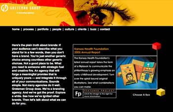
| Our current responsive-design, chock-full-of-magic site looks good no matter what you view it on. And you know at a glance what we can do for you. |
|
| ©BlueSky Business Aviation News | 18th July 2013 | Issue #233 |
| . |
 |
| BlueSky – your weekly business and executive aviation news – every Thursday |
| . |
 |
|